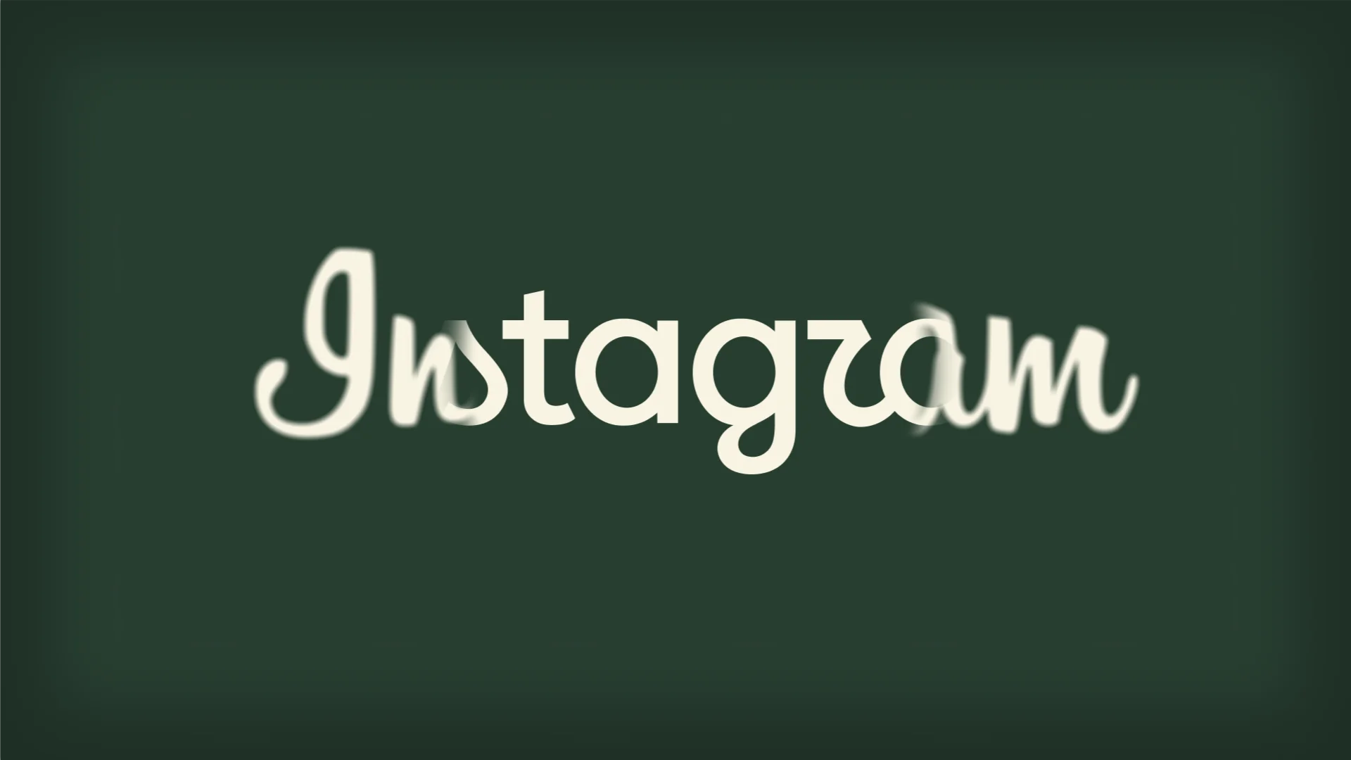
Instagram recently unveiled its first wordmark overhaul in a decade. Head of Instagram Adam Mosseri framed the change as a turn towards something 'cleaner and more modern, with references to the original.' But as with any visual shake-up to an app used by billions of people, the internet has opinions, and many people immediately reached for their red pens.
A cursive crisis: have Gen Z killed the script logo?
A quiet theory has been brewing online and in many classrooms across the UK and United States. Cursive (known as joined up handwriting in the UK), is becoming obsolete. For younger users, the issue goes deeper than kerning, joining letters and ligatures. A lot of Gen Z and Gen Alpha simply can't read joined up handwriting, and they don't really have an interest in learning it either.
This isn't just an internet myth – the stats back it up. In 2010, cursive handwriting was officially dropped as a mandatory requirement from the US Common Core Standards for K-12 education, meaning an entire generation grew up without daily script practice. The Atlantic noted that cursive is fast becoming a niche skill taught to academics like ancient manuscript reading rather than a everyday communication tool. Over 80% of young adults consume text purely in modern sans-serif fonts on backlit screens.
In the UK, The National Literacy Trust reported that more than a third (35.7%) of young people rarely or never write by hand in their free time, with writing enjoyment levels dropping to their lowest recorded point in 14 years. From Instagram's pov, when your primary audience treats handwriting like Egyptian hieroglyphs, maintaining a traditional handwriting-style logo becomes a genuine UX liability.
Typography and design: is Instagram's logo more modern or bland?
From a purely typographical perspective, the old logo was a charming, handwritten script full of character. It felt human, slightly nostalgic and warm in a world that's now dominated by AI and clinical tech branding. The new mark pulls back on the swoops, straightens the letterforms and improves legibility on smaller mobile displays.
Critics argue that removing the handwritten quirkiness turns a distinctive brand into another corporate commodity. In an era where AI is flooding the web with generic visuals, losing an authentic human touches feels like a step backward. Others point out that brand identity isn't static. A wordmark sitting at the top of a smartphone screen needs to render cleanly across hundreds of different device resolutions and scale down seamlessly. As a creative agency in Suffolk, our thoughts are that human-first, unique logos are always more iconic and memorable thanks to their unmistakable character. They stand out in a sea of AI slop.
What happens when you change a iconic logo?
Changing a high-profile logo is never just a routine design task; it carries real commercial and brand implications. In the shorter term, users build muscle memory and visual familiarity (known as mental models) with brands. Any tweak causes temporary cognitive friction (and subsequent online backlash). If you strip away too much character in pursuit of a clean design, you also risk losing the visual hooks that made your brand instantly recognisable in a crowded market.
It’s easy for critics on the sidelines to tear apart a final export. But redesigns happen within complex brand and business discussions, strict accessibility guidelines and long-term strategic goals that outsiders rarely see.
Whether you view Instagram’s update as a necessary update for the next generation or another case of tech 'blanding', one thing is certain – your brand’s typography carries weight, personality and meaning long before anyone reads the words.