
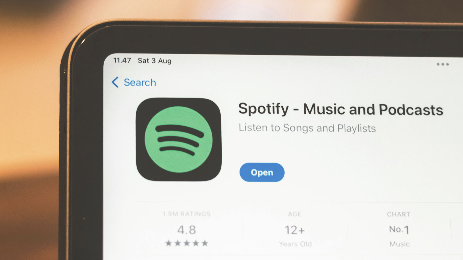
As we know, Spotify is one of those brands that famously tweaks its logo whenever it has a big moment to celebrate. But its latest update for its 20th anniversary 'Your Party of The Year(s)' has left many asking questions on social media such as: 'Why is Spotify a disco ball'? 'Why has Spotify changed their logo'?, and 'Is the new Spotify disco ball permanent'?
The new logo is complemented by the streaming platform's Party of the Year feature, which enables users to view statistics about their playing history, such as their most streamed artist since they joined Spotify, their first-ever song streamed and an all-time top songs playlist (it's a bit like Spotify Wrapped, but supercharged).
Spotify boasts around 761 million monthly users and is the biggest streaming platform for music globally, commanding approximately 31% of the total global subscriber market share. Needless to say, the sudden temporary design of the Spotify logo into a sparkling disco ball has been met with mixed reactions and has been one of the most trending topics on social media in the last few days.
Instead of the famous 2D green circle with lines representing soundwaves, there's now a sparkling green disco ball. Some people are not happy, demanding that the old version of the logo be restored immediately. Feedback on social media has ranged from: “The new logo is not giving lit vibes at all”, to “I keep thinking the app is updating on my iPhone.”
Some have criticised the logo's design very openly: “It looks like there’s an outer circle and the green ball inside doesn’t fit in the confines of the circle, sloppily. Zooming you can see that it’s a disco ball, but it just doesn’t fit.”
Other feedback has been more positive: “It’s ugly but I like it. Everything is so perfectly sterile and over-considered lately.”
Why do we have such strong emotional reactions to logo changes?
A logo isn't just a creative shape or icon – it tells a brand's story. When we see something new like a redesigned logo, especially in a brand we're familiar with, it can sometimes spark an emotional reaction. Usually, this reaction is one of the extremes – it's either loved or hated (also known as polarisation).
People can get very opinionated very quickly about logo designs because they're not just 'design choices'. A logo becomes something we're connected to. It builds trust and identity, and in many cases we see the same logos literally every day in our lives. Our brains create psychological shortcuts to them and recognise them automatically – whether we're watching Netflix, streaming on Spotify, or buying our next pair of Nike trainers. Over time, when we see a logo, we expect a certain experience. When that habit breaks suddenly, it forces our brains to reprocess information.
Then there's our familiarity with logos. It's in our human nature that we prefer things that feel predictable, as predictability signals safety and stability. So even a harmless redesign can feel, at first glance, like something has gone wrong. This doesn't mean that anything has gone wrong, rather that our brains interpret unexpected change as worth attention.
On top of that, brands like Spotify accumulate personal meaning over time. People attach memories to them such as playlists, workouts, relationships and phases of life. Features like 'Spotify wrapped' are designed to make the interactions between us and the app very personal. The Spotify logo becomes a kind of visual anchor for those experiences, and when this changes, it can feel a bit like a familiar place has suddenly changed.
We rather like a sparkly disco ball…
