In 2026, the hottest web design trends are all about balancing sleek performance with user needs. We'll also see a bit of an 'extremes' approach to colour palettes (think either super-loud bright colours, or muted pared-back neutrals). There's a bigger focus on natural AI assistants and integration, as well as super-quick loading times and mobile-first experiences.
Here are some of the top web design trends to look out for in 2026.
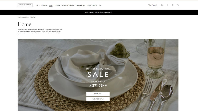
Muted and neutral tones
In case you didn't know, Pantone's colour of the year is a very neutral, slightly-off white shade called Cloud Dancer. In 2026, more websites will start to embrace calm, clean designs with minimalist colours and toned-down palettes. Neutral websites are easier to visually take in and process, reducing eye strain and fatigue while appearing timeless and sophisticated. Take The White Company website as an example – incorporating white and cream tones creates a sense of serenity, clarity and organic luxury. Charcoal or soft taupe typography against creamy backgrounds help maintain a 'soft' feel.
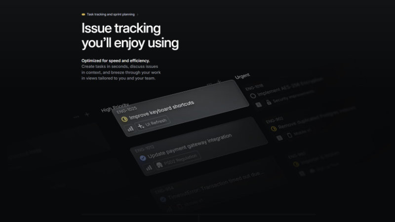
Bento grid layouts
The Bento grid has moved from a cool Apple-inspired trend to a must-have format for high-end web design. It addresses the two biggest challenges of the modern web: information density and multi-device seamlessness. Taking inspiration from Japanese lunch boxes, designers are now organising content into a series of distinct, modular cells that allow for large volumes of information without clutter.
Bento grid layouts work because this approach mirrors the way we consume digital media as we scan or scroll for quick 'bites' of information rather than reading line-by-line. Unlike the rigid grids of the past, the 2026 Bento style uses exaggerated corner rounding and subtle micro-interactions within each tile, making the interface feel tactile and approachable. Bento grids are also highly responsive. Each block functions as a self-contained piece. The layout can fluidly re-shuffle and stack as the screen size changes, ensuring a premium 'app-like' experience on both mobile devices and ultra-wide monitors.
Storytelling through scrolling
This is a trick that has come straight out of Apple's playbook – and more websites will be using it as we head into 2026. As the user scrolls, more content is loaded onto the page that takes them through an immersive journey or brand story. For instance, Apple use it on their website to showcase each feature of a new release of iPhone. In 2026, scroll storytelling has become the gold standard for transforming passive browsing into an active journey of discovery. By breaking complex content into intuitive, smaller digestible sequences, this technique replaces static information with a controlled, rhythmic pace that reveals more when the user is ready to take the next step. The user is in control in revealing each stage of the story. The result is a seamless digital experience that feels less like reading a webpage and more like an immersive storytelling experience.
Glassmorphism
Glassmorphism has evolved from a flashy UI experiment into a functional tool for creating visual hierarchy. Early versions were often seen as more style over substance, but glassmorphism is taking a new direction to introduce materiality and depth without sacrificing legibility. The goal isn't just to make things look 'glassy', but to use translucency to show the user where they are in the site's architecture. By layering semi-transparent panels with a heavy background blur (often referred to as frosted glass), designers can keep background colours and shapes visible as soft glows, which prevents the interface from feeling like a series of disconnected white boxes. A very thin, low-opacity white or light-grey border (usually 1px) gives the glass a defined edge. Different levels of blur can indicate which 'cards' or 'boxes' are closer to the user. It's important to note however that the effect only works if there is something interesting behind it, like high-contrast gradients or organic, moving shapes.
While many sites use glassmorphism as a loud decorative piece, Linear uses it for functional focus. If you look at their desktop app or certain sections of their site, they use a style they’ve called 'Liquid Glass'. Their navigation sidebar uses a high-density background blur. It doesn't just look cool – it allows the vibrant colours of your project icons or background gradients to bleed through subtly. This is a good thing, because too much 'glass' can give you a laggy site and a real (literal) headache.
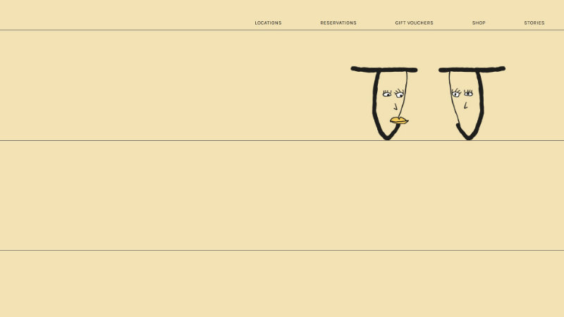
Hand-drawn accents and scribbles
Scribbles and hand-drawn writing are making a comeback in 2026 as a rebellious pushback against the perfection of AI (where every image is flawlessly lit and every layout perfectly symmetrical). Designers are countering this with the intentional human messiness of hand-drawn doodles, rough-around-the-edges illustrations and pencil underlines.
Jolene Bakery is a cult favourite London bakery that really takes an anti-design approach to its website. It's a radical rejection of corporate perfection. For a bakery that focuses on raw, heritage grains and simplicity, the hand-drawn and child-like logo tells you everything you need to know about their philosophy and brand: it’s honest, human and unrefined.
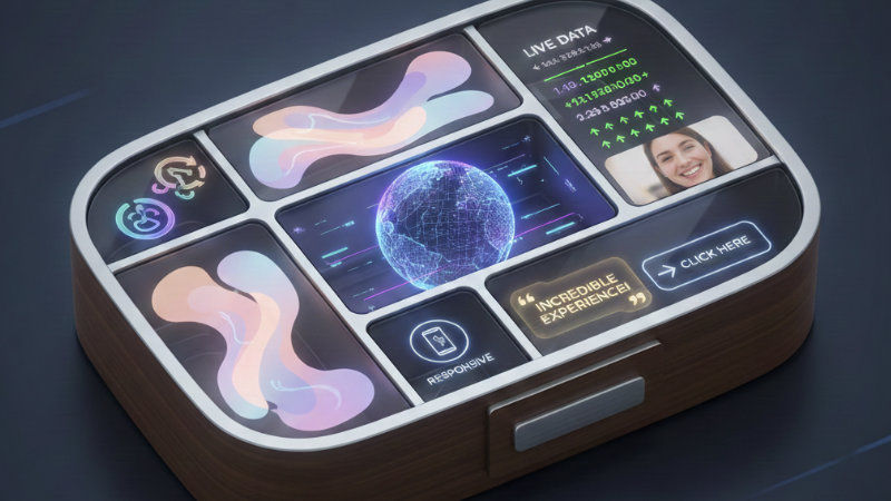
More focus on AI assistants
We've now moved past AI that just gives us suggestions. We’re now in the era of Agentic AI. These are systems that actually perform tasks on the user's behalf. This turns a website from a static digital brochure into a helpful assistant that gets things done.
For example, instead of a user clicking through five pages to find a contact form, an agentic interface recognises what the user is trying to do, pulls the necessary data from the CRM, and does the work for them. Whether that’s qualifying a lead, booking a consultation, or updating a user’s account preferences in real-time. We’re also seeing a move away from flashy, intrusive chatbot pop-ups. The best AI integration is now invisible, sitting behind the scenes to smooth out pain points before the user even notices them. Websites are starting to rearrange themselves based on what a user actually needs to do next. When this kind of personalisation is done well, it feels like good service rather than a marketing tactic to get the user to complete their task (like making a purchase) more quickly.
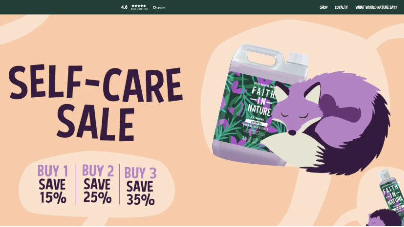
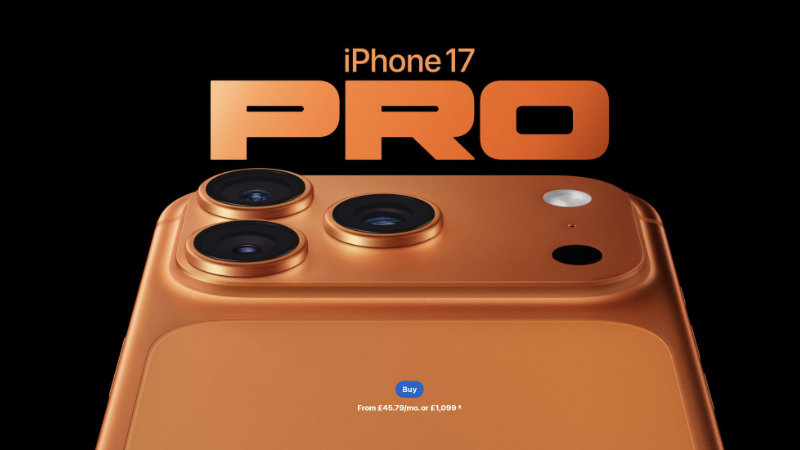
Bold, expressive typography
Expressive typography takes centre stage in 2026, with colourful and personality-driven type and colour schemes becoming a primary branding tool. Designers are turning to oversized headlines, custom letterforms and creative text positioning to communicate brand voices memorably.
Combined with variable fonts and subtle animations, expressive type makes a brand really stand out (especially when toned-down neutrals are also en vogue). Take Faith in Nature's bold and playful use of colour and type positioning.