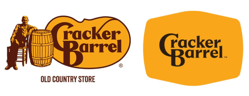
Logos are more than just symbols. They carry an identity based on decades of history, culture and consumer trust. That’s why when Cracker Barrel unveiled a minimalist logo refresh this month, the blowback was swift and severe. Within days, the American restaurant chain based in Tennessee abandoned its redesign and reinstated its familiar logo featuring “Uncle Herschel” and the words “Old Country Store.”
While the outrage became entangled in culture-war politics, there’s a deeper marketing lesson here. When a brand identity is deeply rooted in nostalgia, even small tweaks can really upset loyal consumers, and this is often the tightrope that businesses have to walk. For companies everywhere, (whether you're CEO of a large multi-national organisation or the owner of a small local shop), the branding lessons we've seen from the Cracker Barrel saga is a timely reminder of the risks and rewards of logo updates.
The weight of heritage in a logo
Some logos are so iconic that changing them feels unthinkable. Imagine something other than the swoosh on your Nike trainers. Would they look as cool on your feet? Coca-Cola’s century-old lettering style created by Frank Mason Robinson is still an enduring symbol of American culture, and is a product you can find in even the world's remotest corners. It's longevity gives Coca-Cola ultimate brand power. It signals continuity in a world that constantly changes.
Some logos are so embedded in culture that even the smallest tweaks feel seismic. Closer to home, car manufacturer Jaguar's decision to unveil a bold rebrand with a new logo mixing upper and lower case and a refreshed “leaper” cat design to coincide with an electric-vehicle relaunch, sparked backlash. The move was part of a broader “electric-only” reinvention. The reaction was polarised: while some saw it as forward-looking, others criticised it for abandoning the brand’s luxury heritage. On social media, the absence of any cars in promotional clips and a sleek yet abstract aesthetic sparked controversy. For some, it was sleek modernity for a new age of consumers. For others, it stripped the brand of its classic car status, power and elegance. When heritage is tied to emotion, even subtle modernisation can be interpreted as a dilution of identity.
Cracker Barrel’s redesign fell into the same trap. By removing Uncle Herschel and its “Old Country Store” tagline, it inadvertently severed the connection to the nostalgia that loyal customers held dear. What might have been seen as “clean and digital-first” in a design studio was perceived by customers as an abandonment of history.
When logo redesigns spark outrage
Cracker Barrel isn’t alone. History is filled with examples of logo updates that backfired:
Back in 2010, Gap replaced its familiar blue square logo with a bland redesign, only to face online ridicule so fierce that the company reverted back to the original within six days.
In 2018, Burberry switched its ornate serif wordmark for a stark sans-serif design. Critics argued it stripped the brand of its heritage. In 2023, Burberry reintroduced a serif logo with a refreshed take on its iconic equestrian knight.
In 2019, BT modernised its logo into a pared-back, circular BT wordmark. While efficient for digital use, some lamented the loss of personality compared to its colourful, globe-inspired predecessor.
Each of these cases highlights the same point: design decisions don’t happen in a vacuum. Logos, taglines and mascots live in the public imagination. When altered, they can trigger responses far beyond what the design team anticipates.
Storytelling matters more than design alone
Brand strategists stress the importance of storytelling in logo updates. Devoted consumers need to be kept in the loop and taken on a creative journey as a brand evolves. In the case of Cracker Barrel, the company clearly believed this could be done under the radar without too many noticing.
KFC offers a useful counterexample. Like Cracker Barrel, it has an iconic figure – Colonel Sanders. Over the years, the Colonel’s rendering has been modernised, re-illustrated, and even reimagined by different actors in advertising campaigns. But the essence has never been discarded. Consumers can see the brand's heritage being honoured, even while formats evolve for digital platforms. That’s the delicate balance Cracker Barrel missed.

What brands should learn
The lesson is not “never change your logo.” But it's a change that must be carefully managed and deeply rooted in customer empathy. Before revealing a new identity, brands must ask what heritage means to them, and whether these historical elements are non-negotiable. They should also consider how they'd modernise for a digital age without alienating loyal fans. Most importantly, they need to clearly tell a story behind a redesign, and ensure consumers feel involved. Handled well, a redesign can refresh relevance, signal innovation, and attract new audiences. Done poorly – or without explanation – it can look like abandonment of values.
The Cracker Barrel logo debate shows just how high the stakes can be when altering beloved brand symbols. Unlike Coca-Cola or KFC, Cracker Barrel didn’t frame its redesign with a story, context, or nod to tradition. The result was a backlash so strong that the brand quickly retreated. For businesses everywhere, the takeaway is clear: a logo update isn’t just a design exercise, it’s retelling your brand story – whether that's a new direction, new audience, or growth. If you invite your customers along for the ride, explaining the why, preserving heritage, and showing empathy, chances are you'll strengthen loyalty rather than undermine it.


